Effortless Image Management for WordPress Users
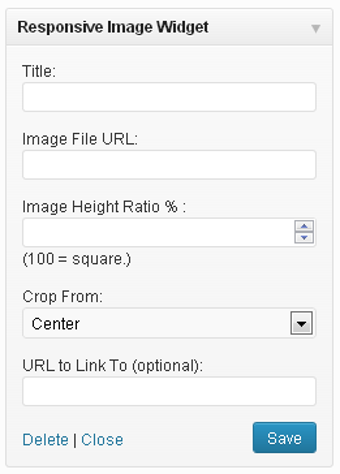
Responsive Image Widget is a user-friendly tool designed for WordPress that simplifies image insertion into widget areas. This free widget caters to non-technical users by allowing them to display a single responsive image while maintaining its proportionality. With features that enable on-the-fly adjustments, users can easily change the image's dimensions without needing external editing software, making it accessible for those unfamiliar with image manipulation.
The widget works by creating a frame for the image, allowing the user to set the size before adding the image, similar to layout tools like Adobe InDesign. Users can input a title, image URL, aspect ratio, and target link URL. The final output is a div with the image set as a background, ensuring it fills the container while remaining centered, regardless of the widget area size.